Here in Australia, it’s spring at last, after our coldest winter for years. So to get you in the mood we’re bringing you Pantone’s Spring 2015 Colour Trend Report.
Who is Pantone?
Pantone has been one the world’s best known providers of professional colour standards for the design industries for over 50 years.
How are the colours chosen?
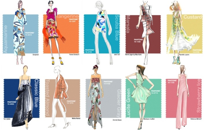
Each season Pantone surveys a range of fashion designers for their input on the colours they plan to use in their forthcoming collections, their colour inspirations and their general colour philosophy. Pantone applies this information to creating their fashion colour report for next season. It’s a reference for all those who are interested in fashion.
How does this help me?
These are the colours you’ll likely see more and more of during this spring and summer, in clothing, makeup, accessories. Indeed, you might want to use some of these shades yourself. Perhaps you’re wearing them already. Or, maybe you’ve seen more people wearing them lately. It’s always good to know what’s going on!
Here’s how Pantone describes spring trends:
This season there’s a move toward the cooler and softer side of the colour spectrum.
An eclectic, ethereal mix of understated brights, pale pastels and nature-like neutrals take centre stage as designers draw from daydreams of simpler times.
Remembrances of retro delights, folkloric and floral art, and the magical worlds of tropical landscapes restore a sense of well-being as we head into warmer months.
And here’s Leatrice Eiseman of the Pantone Colour Institute, explaining:
Many feel compelled to be connected around the clock because we are afraid we’ll miss something important.
There is a growing movement to step out and create ‘quiet zones’ to disconnect from technology and unwind, giving ourselves time to stop and be still.
Colour choices follow the same minimalistic ‘en plein air’ [open air] theme, taking a cue from nature rather than being reinvented or mechanically manipulated.
Soft, cool hues blend with subtle warm tones to create a soothing escape from the everyday hustle and bustle.
Here’s some extracts from Leatrice, evocatively describing these colours:
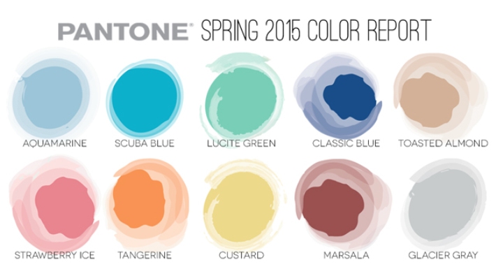
Aquamarine
Cool and calming, ethereal Aquamarine is a shade with a wet and watery feel. Open and expansive, this restful blue also acts as a stress reducer.
Scuba Blue
Conveys a sense of carefree playfulness. Scuba Blue offers a feeling of escape as it is reminiscent of a tropical ocean.
Lucite Green
Fresh and clarifying, cool and refreshing, Lucite Green has a minty glow. Light in weight and also in tone, Lucite Green seems almost transparent.
Classic Blue
Classic Blue inspires calm, confidence and harmony . . . a shade that is strong and reliable . . . thoughtful and introspective.
Toasted Almond
A sun-tanned neutral, Toasted Almond offers comforting warmth and is indicative of a spontaneous spring, summer feeling . . . an organic shade that speaks to authenticity . . .
Strawberry Ice
Suggestive of a cooling and refreshing delicacy, yet its warmth as a colour is quite appealing. Subtle and charming . . . tasty and tasteful . . . a confection colour . . .
Lavender Herb
A shade rich in nostalgia . . . also a creative shade; one that will add a distinctive colour pop whether worn on its own or combined with the other top Spring/Summer 2015 colours.
Tangerine
Spontaneous and gregarious, Tangerine is a juicy orange shade that is energising, yet not jarring to the eye. Good natured and friendly, but with a tangy edge . . .
Custard
Custard is a delicious and delectable yellow. Sweet and sunny, Custard is a cheering tone that brings thoughts of pleasant relaxation and comfort food.
Marsala
Sensual and bold, delicious Marsala is a daringly inviting tone that nurtures; exuding confidence and stability while feeding the body, mind and soul. . . . a sophisticated, natural earthiness.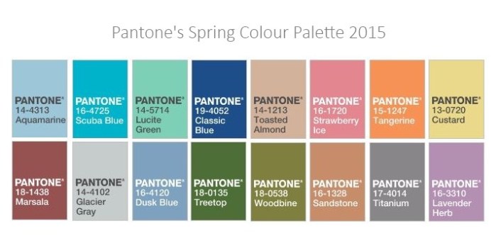
Glacier Gray
An unobtrusive gray that contrasts and enhances; bouncing off other shades without taking away from them as it slips into the background to allow other colours to take centre stage.
Dusk Blue
Dusk Blue is ultimately dependable and faithful. In a world that has become increasingly chaotic, the nostalgic Dusk Blue enables us to retreat into a safe place of quiet blue calm.
Treetop
Speaking to restoration and new beginnings, Treetop is a natural and fertile green. Ideal when used as a background to other shades . . .
Woodbine
A classic yellow-green that could be used with anything and everything, Woodbine is a hue of foliage, grass, and growing plants.
Sandstone
Earthy and real, Sandstone provides us with a return to nature and what is beautiful, simple and memorable.
Titanium
Strong, masculine, and solid, Titanium is a gray shade that speaks to timelessness. Classic and tasteful, there is an implied quality attached to anything so long lasting.
Well, what do you think? Are you wearing these colours? Have you seen them more often? Let us know what you think.